
Android 5.1 Lollipop has a lot riding on it. As the newest version of Android and Google’s Material-themed vision for the future. It needs to correct some of the failings of Lollipop and make us believe that Mountain View has a plan to lead us into the future.
5.1 is the Lollipop Nexus users wanted, one with fewer bugs and more potential for the future. However, is it the future we want? We loaded up a preliminary CyanogenMod 12 ROM on a test Galaxy Nexus to find out.
The Good: Android Has Never Looked Better

The fifth edition of Android brings a major change to what we used to know. Google is throwing out years of design and development on its old Holo theme in favor of Material Design.
The good news is Material looks beautiful. Android has always been the ugly duckling to iOS, but Google is making a real case for design with Lollipop and it is a strong one.
Lollipop is all about bright colors and flashy animations. It’s about presenting content to the user in a colorful, beautiful way. For the most part, it works.
I especially love the animations. Touching items leaves a wave around your finger. Apps slide in and out of the bottom of the screen. The new app switcher is something else.
The animations and new design add some flair to Android without being excessive in the same way as, say, Windows Phone. It’s a good move by Google.

Lollipop isn’t just looks, though. It adds the usual bevy of bug fixes, performance improvements and better battery. 5.1 solves the memory leak issue introduced in 5.0, which is much appreciated.
Google also finally, finally added an auto-rotation switcher to its quick settings. The quick settings also rearrange themselves based on what you most use, making them “smarter” than the old setup.
Overall, Android 5.1 seems like a far better version of Android than anything we’ve seen from third-party OEMs or even Google in the past. The slick design and good-looking animations are far more convincing than anything from Samsung or HTC.
The Bad: The Design Isn’t Done Yet

And yet for every step forward Google has taken, there are steps back. Material Design looks great because it’s a good-looking marriage of animations and flat design. However… it’s too flat in some places.
You notice it first at the lock screen. Where previous versions of Android had a lock icon to swipe right, Lollipop’s lock screen has no visual indicator of what to do with it.
Tapping the unlock icon brings up a small message to swipe up to unlock, but this is completely unclear and too unfriendly to users.
You can see the same thing with Google’s approach to text boxes. When you get a popup with text options, those options are simple all-caps words with no visual indicator of “tapability.” Again, this is flat design gone too far. Even Apple puts boxes around its popup options to make it a little easier to understand at a glance what they are.

The notification drawer has also been changed, and not really for the better. The background has been completely removed. Now, you swipe down some linked notifications overtop the rest of your content. Lollipop barely dims the background.
Accessing the quick settings is even worse. It requires swiping down from the top to open the drawer, then swiping down again. This is far too unintuitive for the masses. I wouldn’t have found it if I had not been looking.
Flat design can be beautiful, as exemplified by the rest of Lollipop. I’m not advocating a return to green felt and digital leather.
However, a design should be easy to understand and use first and beautiful second. Lollipop does not always meet that criteria.
The user-unfriendliness isn’t much of an issue at the moment, as the majority of Lollipop users are Nexus-toting Android geeks who are more than proficient at using the software.
However, if Google wants to send this OS mainstream, it needs to become a hell of a lot easier to understand.
The Ugly: Silent Mode and Updates
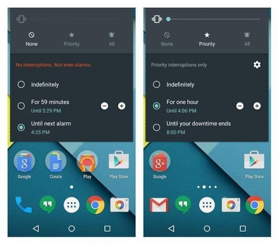
The greatest offender left standing in Lollipop is its asinine approach to silent mode and alarms. Google felt the need to ruin a perfectly good system. The results are bleak.
Now, if you want to silence your phone, it means turning the volume to vibrate, selecting “None” for interruptions, and telling Android not to disturb you until the next alarm.
(Our CM12 ROM handles this slightly differently than stock Android, so we’re using shots of it from AndroidPit)
This setup mutes your phone until the next alarm, but it also requires the alarm to be within the next 12 hours.
These changes are absurd and unnecessary. It is worse than the old setup and far more confusing. This isn’t bad visual design, it’s just bad software. I should not have to jump through so many hoops to set a simple alarm when I could just hold the volume down key before and the alarm would still work.
This is a simple thing, and it shouldn’t be so hard to get right. Google has no excuse.
The other major software design oddity is the new recents switcher. It jumps between tasks within an app instead of entire apps. For example, all of your Chrome tabs show up as separate entries.
On one hand, I get it. I’ve wondered about it before. Why should I have to use one tab button to switch apps and another to switch Chrome tabs? It makes a sort of sense.
However, this is yet another thing users are not used to. It’s really weird even to me, and I’ve been using Android since 2011. New users or iPhone converts won’t get it.
While there are reasons for splitting tasks in the app switcher, this move is still too confusing and should not have been done.
Final Thoughts
Android 5.1 Lollipop is a promising start to the next big thing. It’s big and beautiful with lots of big flaws. The design is weird and not ready for the masses. Google’s onto something big here. It just needs more work.


