Sometimes the best way to tell a story is without words. A good chart can visualize data without you having to do a ton of writing to lay it all out in paragraphs.
Getting a good chart, however, is a tougher problem. Taking screenshots of your Excel creation doesn’t cut it in today’s online world. People expect data visualization tools to be cool and more useful than that. Here are a couple free tools you can use to display data online.
Free Tools to Visualize Data Online
Infogr.am

(Follow this link to see the live example of this chart that I made)
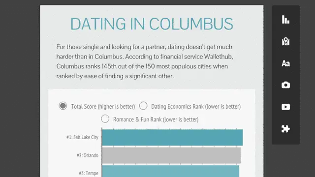
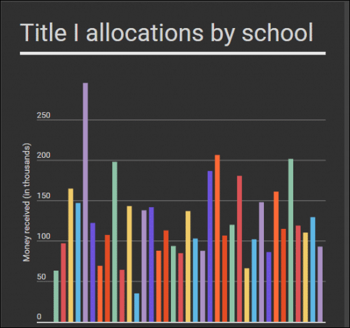
Infogr.am is a fantastic tool for creating web-first charts and data. It uses a simple click-and-drag interface with beautiful templates to create easy JavaScript data displays.
Infogr.am charts stay on their servers and live on your page with a simple embed. They have all kinds of neat layouts and ways to visualize data (whether in single charts or infographics). Little touches like showing the exact amount of a column when you hover over a bar in your bar graph will delight your users.
Two caveats about Infogr.am. The first is monetization. These guys are targeting big companies with money to spend. You can create a dozen infographics for free with the free tier templates before they cut you off, which isn’t bad.
The second is data interaction. By default Infogr.am charts draw data from the company’s internal spreadsheet tool. This tool is finicky and bizarre and difficult to use. Something as simple as copying all the data from one chart into a new one never worked for me. For the sake of your own sanity, put your data into Google Sheets and import that into Infogr.am.
Timeline.js
Knightlab has a couple of neat tools for journalists and content creators working on the web. One of the coolest is their Timeline.js project. It lets you collect disparate media like text, images, YouTube videos and Google Maps into a timeline readers can click through.
The finished product lives on the Knightlab servers, requiring only a Google Sheet from you with all the content filled in. That’s one of the caveats about Timeline.js- you have to fill in the timeline in exactly the correct format. Pay attention to the documentation.
The other caveat is that these timelines look best on phone or desktop. The thin-but-not-that-thin layout of tablets squeezes the layout in some weird ways.
SoundCite
Oh look, another awesome Knightlab project. This one allows you to put inline audio files that play when clicked or tapped. Instead of talking about a sound, why not let your readers hear it themselves? And instead of putting it in a YouTube video or something, why not put the audio right there in the text?
StoryMap
This one is really cool too. StoryMap builds a slideshow of sorts that takes readers around an area and displays pictures and text at each point. It’s a great way to break down a story from a geographic level with a lot of awesome transition effects.
The only caveat I’d offer on StoryMap is that those transitions make it more suited for desktop and not as good on mobile. Heavy effects are fine and good when you’ve got a robust desktop browser. Not so much on a low-end Android phone or iPhone 4.
Final Thoughts
What other tools do you use to visualize data? Let us know in the comments!


