Those interested in finance, investment, or traders in the stock market will understand the trendlines’ concept and their use in reading the data. Any person aiming to become a stock trader must know how to add a trendline in Google Sheets to read data accurately and make correct decisions regarding their investments.
But again, a trendline isn’t only used in the finance world; it has a broad spectrum of usage. In simple terms, a trendline, also known as the line of best fit, is drawn on a graph comparing data points of two datasheets. It is used to indicate the pattern in which data fluctuates. Thus, it is used to measure the behavior of data. Also, it is essential to know how to make a graph in a spreadsheet before learning to add trendlines.
How To Add A Trendline In Google Sheets For Accurate Data Readings
Adding a trendline gives you deep insight into how the data varies according to various time periods. In simple terms, a trendline with a downward slope indicates a loss, and an upward slope indicates positive growth. Trendlines can be made on any graphs except pie charts. Let’s see how to add a Google Sheets trendline and use it for daily purposes.
What Is The Use Of Trendlines And Where Can They Be Used?
As we have specified above, trendlines can be used in measuring the behavior of variable data. This, in turn, helps users in making accurate decisions about financial and scientific data. While trendlines find their use mostly in the finance domain, they can also measure many fields’ progress.
In terms of education, a student can study the patterns of his marks in various subjects. Similarly, a sportsperson can study his statistics and chalk out the areas where he needs to improve. In business terms, executives can compare the data between their revenues and profits to decipher the best times for leveraging their marketing campaigns.
How To Add A Trendline In Google Sheets?
Users need to have a new chart ready before inserting a Google Sheets trendline. You can learn to insert a new chart, provided you have the required set of values entered in the spreadsheet.
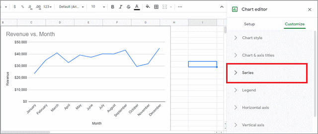
Once you have inserted the graph chart, just double-click on it; a pane of options will appear on the right side. Click on the Series tab in that pane.
After entering the Series tab, check the Trendline checkbox.
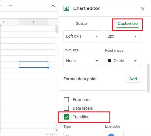
Once you select this option, you will see that a straight line passes through the graph in the chart.
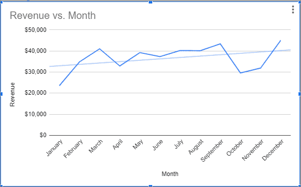
That’s the most basic way to learn how to add a trendline in Google Sheets. A trendline will also help users in deriving the slope of a graph chart. It is also important for users to know that a trendline can be added only on the desktop version of Sheets. The Google Sheets app does allow you to make charts and graphs on the mobile app, but it has no options for inserting trendlines.
How To Edit A Trendline
If you wish to add more complex functions or edit the various aspects of a graph’s trendline, you can do it from the right pane. Google Sheets offers multiple options for editing so that you can add trendlines as per your preferences.
First and foremost, you can set the type of Google Sheets trendline for scatter plots you want to display in graph charts. Linear, Logarithmic, Exponential, and many more; you can click any of these options as per your requirements.
Next, you can also customize the line color, thickness, and the opacity of your trendline in the right pane. Opacity is nothing but the degree of transparency of a line. Google Sheets also allows users to customize the label of a trendline in a spreadsheet.
How To Make A Slope In Google Charts
Before moving onto calculating the slope of a graph, let’s have a look at the basic definition. A slope gives the count of how much a particular line falls or rises over a certain distance. While learning how to add a trendline in Google Sheets, it is vital to know how to calculate a slope to get an idea of the average increase or decrease in the values.
You have to change the label of the trendline to get the slope of a graph. To do so, click on the Label field, and select the Use equation option.
Now, navigate to your graph, and you will see an equation, as shown in the figure below. This linear equation is known as y=mx+c.
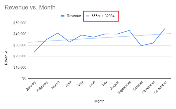
The term to the left of the variable ‘x’ in the equation is the slope we are looking for. Here, the slope is 655, meaning after every passing month, the revenue increases by $655. That’s how you can calculate the slope after learning how to add a trendline in Google Sheets.
Conclusion
A trendline is a vital aspect to consider when it comes to data comprehension and analysis in various fields. It is a line used to decipher the patterns of data and make correct decisions accordingly.
Trendlines can be used in various fields for data analysis, but it finds most usage in business analytics and stock markets. If you are a businessman, marketer, or a stock trader, accurate data reading with the help of trendlines is a skill you need to master for correct decision making. Hence, it is essential to know how to add a trendline in Google Sheets.
Apart from trendlines in a spreadsheet, slope measurement is also an important term that helps users measure and analyze data. It is defined as the measure of how much a line rises or falls over a given period of time.


